Maybe you noticed I’ve been absent for the past couple of weeks. Sorry for that and thank you for sticking around. I’m a big advocate of consistency though so, naturally, I’m frustrated that stuff like this happens.
Anyway, I’m also thinking of solutions already because I know I’ll probably have more weeks like these. So soon you might notice I’ll change the format sometimes, making it more concise and powerful rather than long and detailed.
On a more positive note, it’s been a great couple of weeks with my speaking gig at App Growth Week, a work trip to the Netherlands, some traveling with the fam, and exciting plans for Easy App Reports.
But without further ado, let’s get into this week’s newsletter:
3 metrics to master your app’s subscriptions
If you’re used to looking at new subscriptions to measure your growth but can’t seem to understand the forces at play around it, this article is for you. Hell, I guess it’s probably even more helpful if you don’t have access to fancy dashboards or a data team to help you out every step of the way. All tips I’m giving here can be retrieved directly from Google Play or the App Store.
Anyway, I’ve worked with multiple app subscription businesses in the past eight years, and if there’s one thing I learned, it is how to take a holistic approach when diagnosing growth problems.
When understanding how to grow a product, you must look up and down the funnel to understand all variables to identify problems and opportunities. In the article below, I’ll go through some of the shortcuts to understand the levers involved – and maybe it’ll help you get a feeling of where your opportunities are.
Moving beyond Sales Conversions
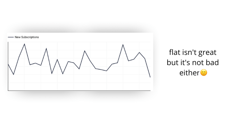
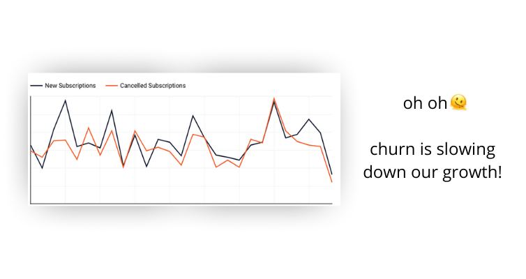
The first thing you can do is have your cancelations alongside your new subscriptions: that’s the easiest way to level up your analytical game. By doing so, you can have a more holistic view of your subscription growth and understand if you should focus more on acquiring subscribers or on retaining them.
Extra tip: look at your install-to-subscription conversion rate to get a sense of how well your product can convert free customers into paying customers.
Ideally, we want it all, of course, but it’s crucial to have in mind where’s the biggest problem so we can put our eggs in the right basket.
Think about it: you’re building a recurring revenue business. Therefore, increasing the total amount of active subscribers is what you want – not only acquiring new paying customers.
The longer your customers stay subscribed, the more your revenue will grow. That revenue can then be reinvested in expanding your acquisition channels and improving your product.
So creating the habit of looking into cancelations as frequently as you look into acquisition is the easiest way to get used to looking at the whole picture.
If you’ve never seen this information before, here’s how to find it:
App Store: Apple makes it hard to extract this Information as it’s only available through their API. Luckily, Easy App Reports provides a connector so you can pull that information to Google Data Studio.
Google Play: Go to Monetize > Subscriptions > Overview – also available on Easy App Reports
Net Subscriptions
Building on cancelations, I see it’s helpful to look at “Net Subscriptions” too:
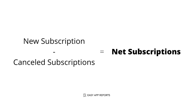
New Subscriptions – Canceled Subscriptions = Net Subscriptions
This will give you the ratio between your acquisition and churn, providing a shortcut to measure your Marketing and Product efficiency throughout your funnel. Cool, right? I look at this metric daily as it contains the most crucial information I need to know sales-wise.
One thing to watch out though: today’s subscriptions don’t drive the cancelations of today. It’s more likely that the cancelations you see today are actually caused by customers who subscribed weeks or months ago. So some people might say that it’d be unfair to run such a calculation. I admit they’re not entirely wrong.
If you’re an Excel pro, though, you can adjust that calculation based on the time lag between a subscription and a cancelation to get a better proxy.
For example: let’s say your users stay subscribed for nine weeks on average. What you could do to incorporate that into your formula is:
New Subscriptions (9 weeks ago) – Canceled Subscriptions (9 weeks ago) = Net Subscriptions
The disadvantage of this model is that it can take weeks or months to have this overview, making it a lagging metric. And we know what happens to lagging metrics: they’re ignored.
So I’d still advise you to run it the way I initially proposed and keep this shortcoming in mind.
Voluntary vs Involuntary Cancelations
I can’t emphasize enough how important it is to differentiate these two. Your reactivation tactics must be utterly different when approaching voluntary or involuntary churn.
Voluntary: your user made the decision to cancel and proactively did it.
Involuntary: the subscription was canceled automatically due to multiple failed payment attempts, or the payment method is now invalid.
80% of the results I get for my clients are driven by involuntary churn recovery. Here’s how to find that information:
App Store: Same problem: This information is only available through their API, which you can extract without coding using Easy App Reports.
Google Play: Go to Monetize > Subscriptions > Overview (also available on Easy App Reports)
How to approach it
Involuntary: follow up with your customers, offer help and provide simple instructions on how to reactivate their subscription. It’s a good idea to gently remind them of what they’re missing as well to increase the likelihood of getting that customer back.
Voluntary: These are people who made a conscious decision to walk away from your product. As a consequence, the chances of recovering such customers are tiny. Brian Balfour (ex VP of Growth from Hubspot and the founder of the world’s leading Growth program, Reforge) has a pretty solid case against trying to regain such customers – he even calls this a “Hail Mary resurrection.”, and it’s an opinion I share.
The best thing you can do here is to work backward from the reasons why your customer churned in the first place and improve your product to prevent it from happening again in the future. This leads us to our final metric:
Explore your “Cancelation Reasons” often.
I’m blown away by how many people don’t know this one. Marketers, Developers, Product Managers, and even Founders miss it. But not us. Right?
Google Play and the App Store provide high-level information on why your customers unsubscribe by running a survey. Yes, you heard me: you already know why your customers are churning. Now, you just have to take that information and act on it.
App Store: You know the drill: use Easy App Reports to extract your cancelation reasons.
Google Play: Go to Monetise > Subscriptions > Cancelations > Cancelations with written responses – also available on Easy App Reports
Ok, now what?
Now that you have a better picture of what your app’s growth looks like, you can work backward to figure out what are the best initiatives you might want to do to grow your sales and revenue.
Is your churn growing? Maybe it’s time to invest in product development or tweak your traffic sources.
Is your acquisition going down? Time to do your best User Acquisition work out there.
Acquisition and Churn are the same? Pull one up and push down the other.
It’s a simple thing, and it’s underestimated at the same time. Often we get trapped in optimizing for something that we don’t understand why is behaving in that way. Hopefully, during this article, I was able to provide you with a few tools to crack the problem so you can be more successful with your app.
📕 What I’ve been reading
The S.W.I.P.E.S. Email: this newsletter is super fun to read and I always learn something new, even if I just scroll through it for half a minute. For me, it serves as a constant reminder that building visually appealing content is not always necessary.
The Manual: A Philosopher’s Guide to Life: I have a book club with a few friends and this is the one we’re currently reading. Lots of people make jokes that life doesn’t come with a manual, but maybe it’s because they didn’t read this book yet. I already read it a couple of times but I’m planning to read another one because there’s just so much powerful stuff in every line of this book.
How to write a one-pager: “Your colleagues are most likely building decks of 50-80 slides to present a strategic recommendation for executive approval. Decks of this size take the better part of a week to build, over an hour to present, and at least an hour for an executive to review before and after a presentation. Slides tend to be crammed with data and hard to understand without live voiceover. A one-page memo, on the other hand, is a simple, disciplined approach to getting alignment and buy-in for strategic initiatives that will move the needle for your business“. I rest my case.